The Elastic dashboard is an incredibly versatile tool for displaying data in a dynamic and visual format. This page will provide a basic breakdown of the dashboard creation screen and a simple example.
Accessing the Dashboards
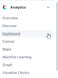
- From the navigation menu on the left, browse to the Dashboard section under Analytics.
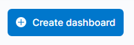
- On the top right, select Create dashboard.
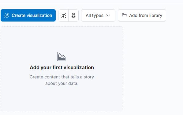
- The screen will display a blank dashboard in which visualizations can be created and adjusted.
Visualization Workspace Overview
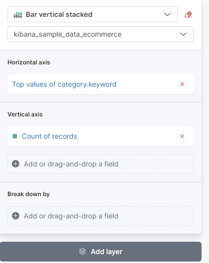
- You can add a new visualization to the dashboard by selecting Create visualization.
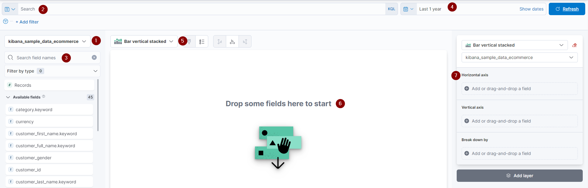
- Index Selection - Before drilling into a dataset, you must first select the associated index. This is done with this drop-down menu.
- Search bar - The search bar utilizes KQL query operations, which allows for auto-complete and suggestion-based functionality.
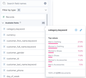
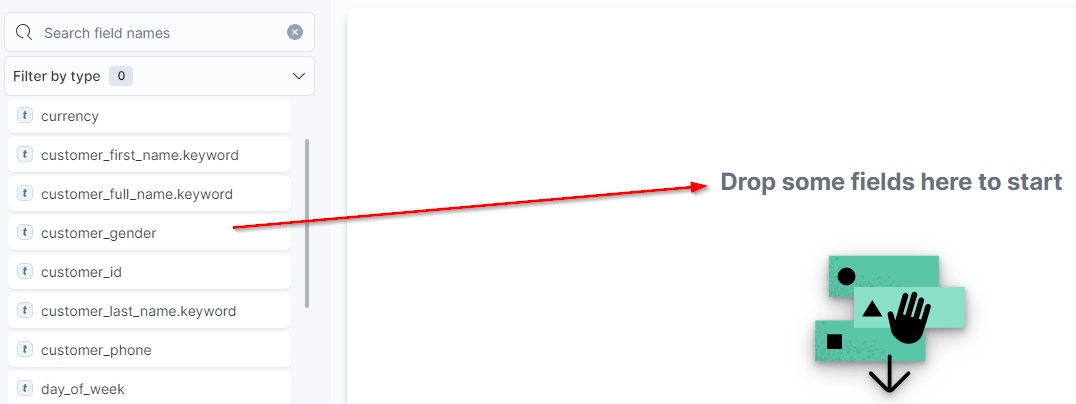
- Field Selection - This section displays the individual fields available for aggregation. You can refine the listing from the search and filter field at the top. Selecting a single field will display a sampling of available data. Pressing the symbol will move the field into the dashboard workspace.
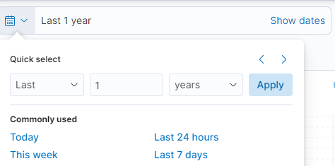
- Date Range - This option allows selecting a timeframe from which to query documents. The range can be absolute (between dates) or relative (i.e., last 30 days)
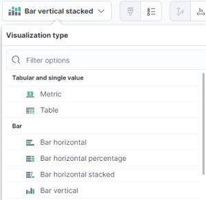
- Visualization Type - This drop-down will display available visualization types such as tables, areas, circles, and bar graphs. If a new chart is incompatible with the already selected data field, a symbol will appear next to it, stating that Elastic will remove the incompatible field.
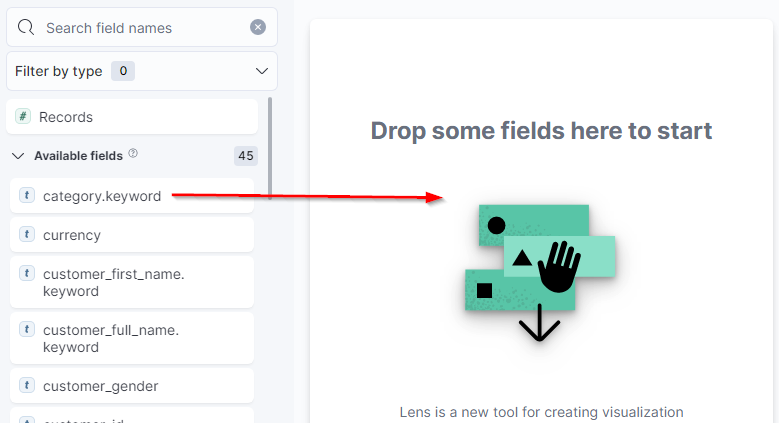
- Workspace - The central section of the dashboard creation screen is the workspace, where Elastic will generate graphs from the selected criteria. Dragging a field to the middle will auto-create a chart and display further graph type selections below it. Adding more fields will update the graph with different suggested graph types.
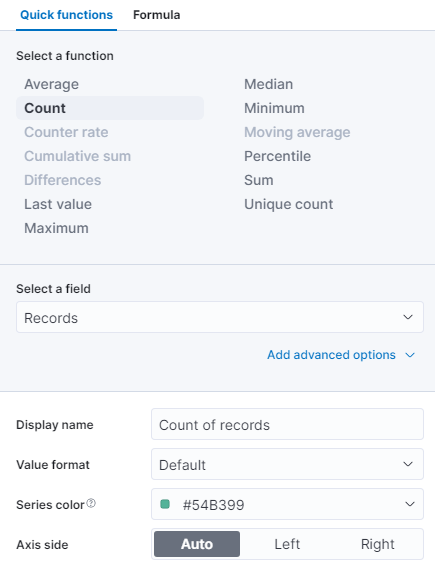
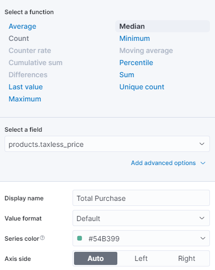
- Layer Settings - Once the needed data fields have been selected, the layer setting section will populate. This includes function, display name, value format, and color. Selecting a field will allow you to modify the presentation.
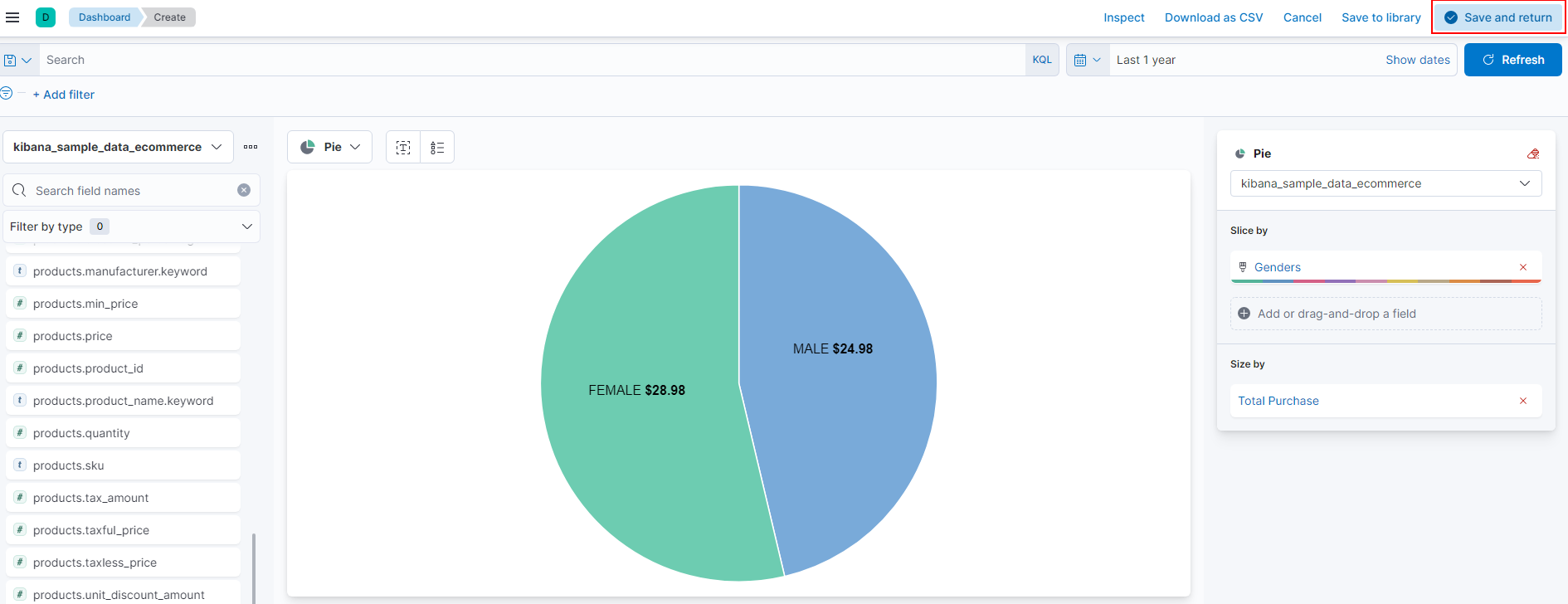
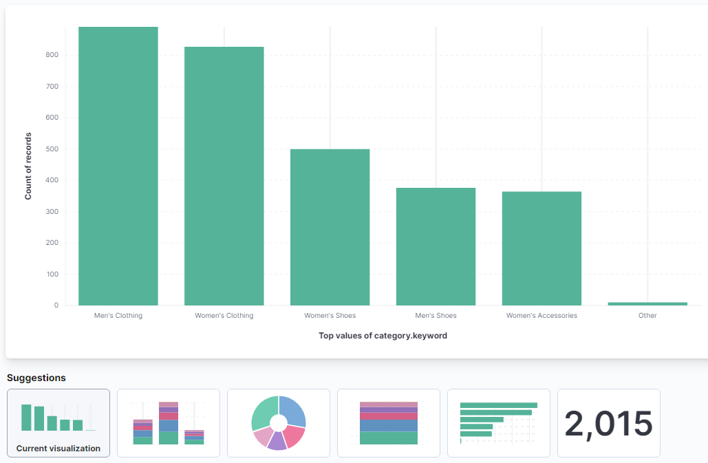
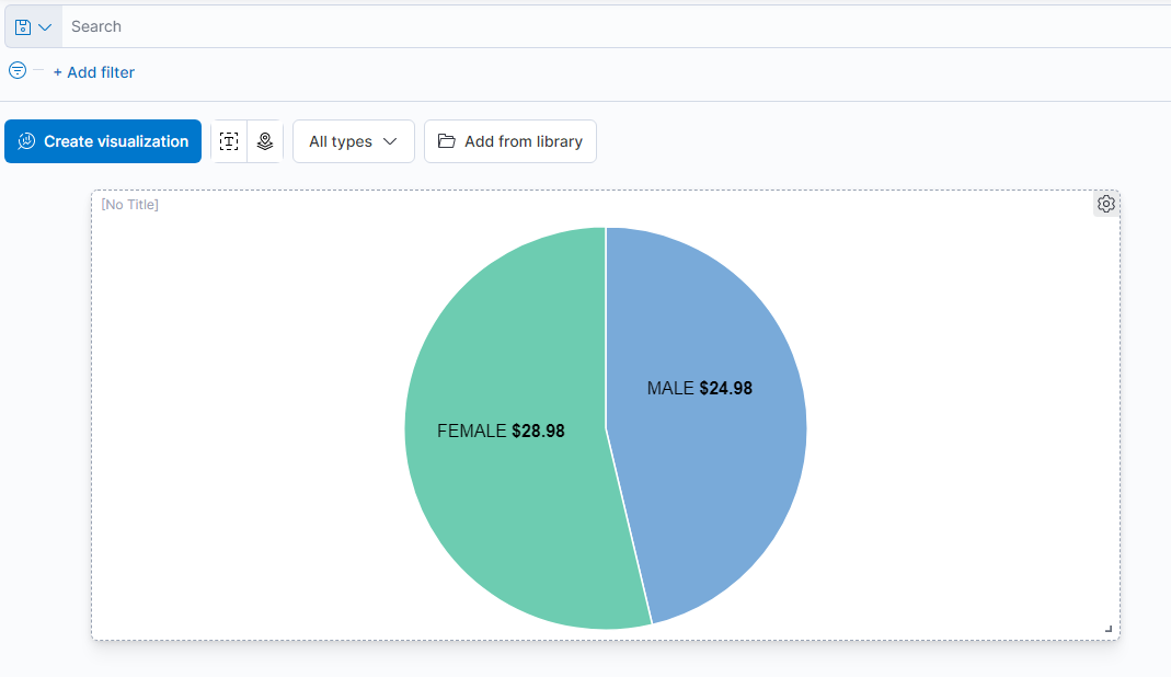
Visualization Example - Pie Chart
- In this example, we will be creating a simple pie chart detailing the median total purchase price compared by gender. From viewing the documents from Discover, I know that I need the customer_gender and taxless_total_price fields to create this graph.
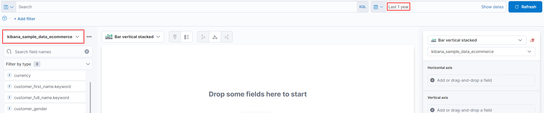
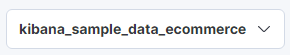
- The first step is to set the Index and date range. In this case, I've selected the Kibana eCommerce index from the last year.
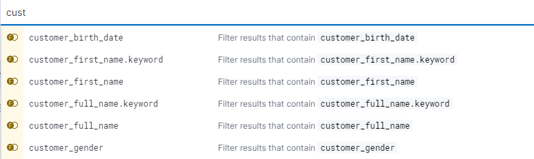
- Next, I will drag and drop the two required fields:
customer_gender
taxless_total_price
... to the dashboard workspace
Elastic will automatically generate a graph based on the presented data fields. From here, the display can be adjusted and refined.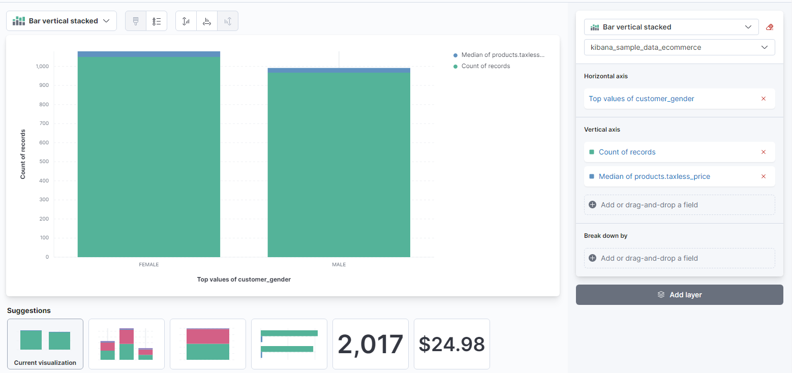
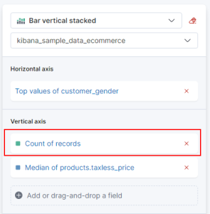
- The next step will be to remove the Count of records field from the Layer settings section on the right. It is not needed for this type of graph.
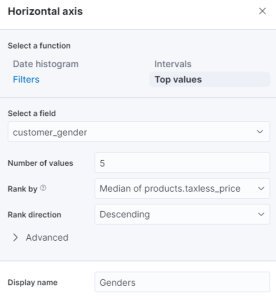
- Next, I will select the Top values of customer_gender from the horizontal axis and change the display name to just Genders.

- We are doing the same for the Median of products.taxless_price by changing it simply to Total Purchase. Since we will be working with the Median price, the function does not need to change.


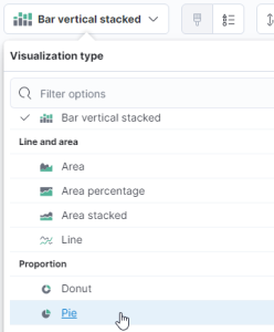
- Finally, we will select the Pie chart from the Visualization type section at the top.
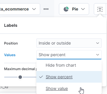
- At this point, we have a pie chart that shows the percentage of slices instead of the price. You can correct this by selecting the Labels icon next to the visualization type drop-down and changing it to Show value.
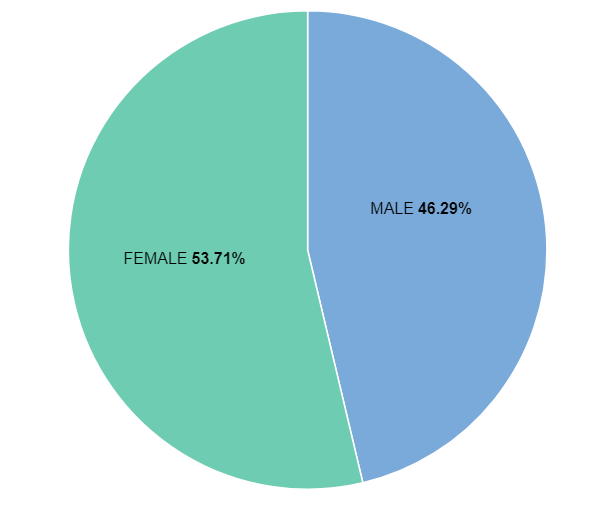
- The graph is now displaying as we would expect and can be saved by selecting Save and return at the top right.
- The new visualization will now appear in the dashboard view. It is modified or titled from the gear icon on the top right or repositioned by dragging the tile itself.